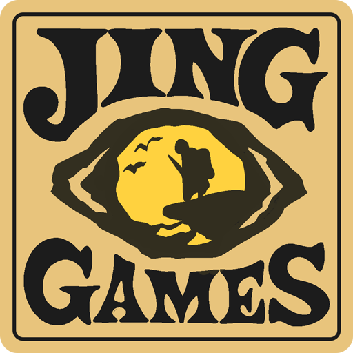
"Jing" springs from the "晶" in my partner's and my names. Three suns stacked in oracle bones once meant stars in the sky.
Video Games first land on the eyes. So we started with "睛" (eyeball)—homophone to "晶." The logo's heart: an ancient eye glyph, raw, gritty, a primal spell's punch. We wanted cave-paint vibes—alien yet déjà vu.
What to tuck in the eyeball? Star charts, distant peaks, stargazers… We settled on a minimalist silhouette: a trekker gazing afar, birds in tow. Abstract, yet crystal-clear—one glance screams "set forth." Not mere pattern, but RSVP: step through these eyes into another realm.
For type, I dodged sleek sans-serifs and grabbed French Clarendon. It once branded Wild West wanted posters and 50s-60s sci-fi flicks—reeks of conquest and the unknown. Hand-sketching the "I," it rose like a Corinthian column—tall, weathered. That instant, I felt fonts could narrate too.
Final cut locked in. Borrowed "晶"'s sound, "睛"'s image. The eyeball's "expedition" cameo? Our studio's warmest invite.